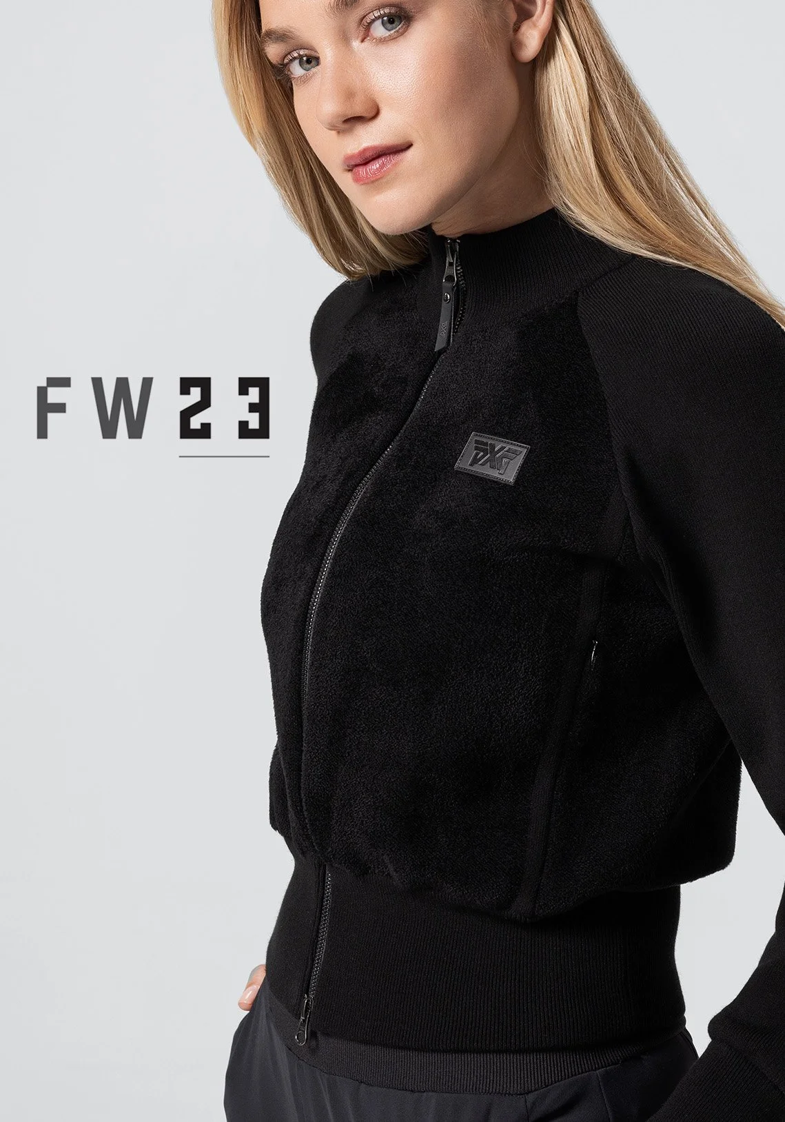
For PXG’s Fall/Winter 2023 launch, we wanted to tell a story about “Stepping up to PXG.” To create a striking and modern evolution of typical golf apparel photography, we moved the shoot off course and built an in-studio set of stark white with different leveled steps, each capped with grass.
I directed the photoshoot and built out the creative across social, web and a printed look book, layering tech-inspired graphics and cropping on top of the photography to echo the collection’s technical details and elevate the brand into a distinct, editorial identity.
Creative Direction | Art Direction | Campaign Design
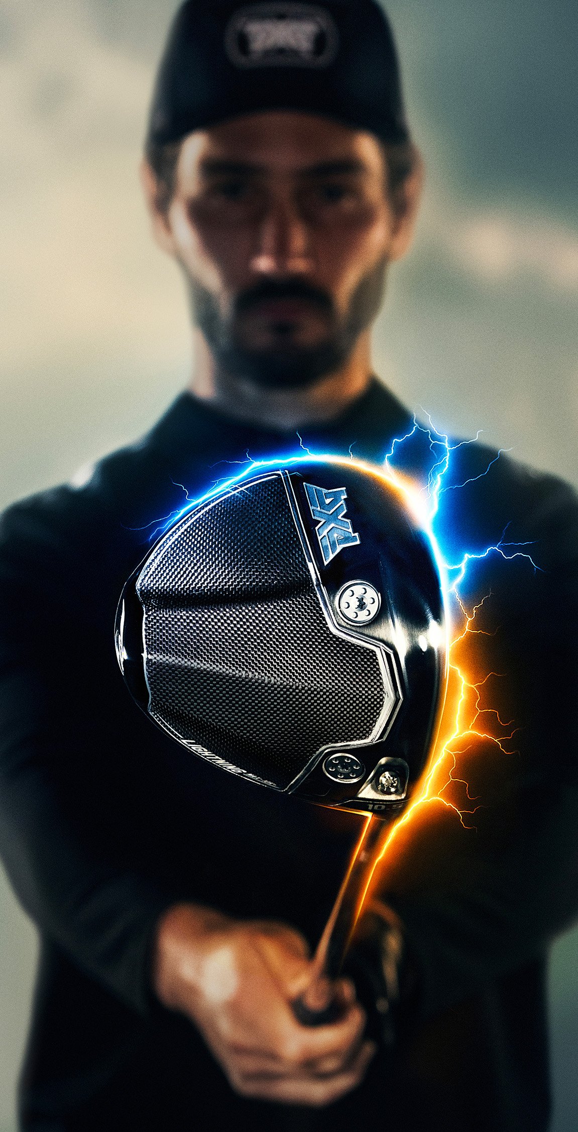
For the launch of PXG’s latest flagship driver, we created an entirely new cinematic world of golf courses and billowing clouds, where the moment a player’s hand meets the club, energy surges, treating performance as raw, elemental power.
I led the concept and creative direction end-to-end, from world-building through AI image generation to overseeing multiple photoshoots, visual effects artists, and designers to bring the campaign to life across TV, social and web.
Creative Direction | Art Direction | Campaign Design
A charter school network came to us needing a campaign to close the gap on funding a campus expansion, complete with a multi-purpose field, outdoor space, and additional classrooms. We built the campaign around a metaphor parents already understood — their kids were in a race to become their best, and now the schools were in a race of their own to complete the expansion.
I led the creative and visual direction across the full campaign — print, digital and on-campus signage — rallying around the tagline “Fund the Finish” that reframed fundraising fatigue into shared urgency using high-energy, sports-inspired design language.
Creative Direction | Art Direction | Campaign Design
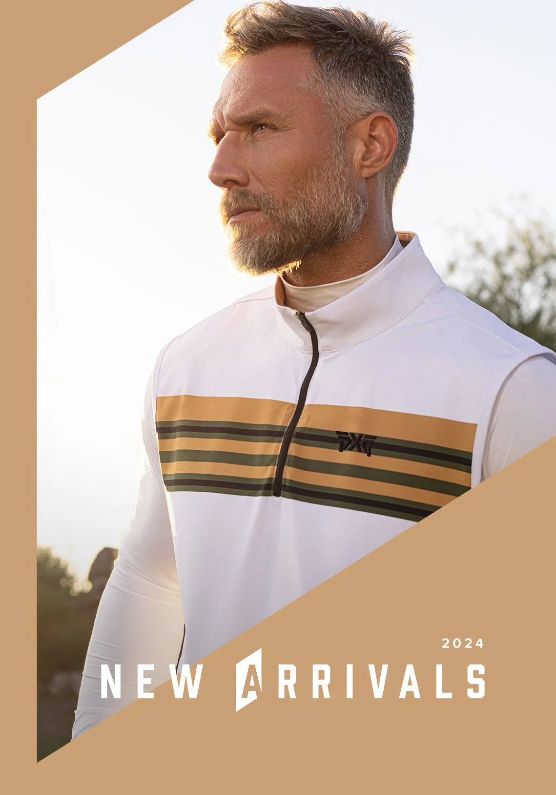
For PXG’s Spring/Summer 2024 launch, we took an fashion-editorial approach to on-course photography, bringing the studio outdoors with modern, painted walls that stood in stark contrast to the natural forms of the landscape. The result was a collection that felt bold and innovative while still appealing to our core audience.
I served as art director on set and creative director for all graphics post photoshoot. Finding the right font treatments, geometry, motion design and layout helped bring a rich identity that mirrored the apparel and amplified the photography.
Art Direction | Campaign Design
When a personal injury attorney with a heavily tattooed, imposing build needed a brand, the obvious move was to lean into the mean. We did the opposite. Underneath his rugged exterior was one of the warmest, funniest people in the room, so we built his brand around that contrast. The Anti-Lawyer Lawyer was born, here to subvert all your personal injury attorney expectations.
As art director and lead designer, I pitched the initial concept of the award-winning TVC where Byron plays it straight, but through a series of absurd mishaps, ends up destroying all the stereotypical advertising conventions his peers are known for. On the identity front, we created a logo, website and collateral that carried the same irreverence without looking out of place in the industry.
Creative Direction | Art Direction | Brand Design
Wanting to establish their thought leadership position, Genpact needed a new way to get their content into the hands of their audience. The solution was a news delivery app that was both easy for the publishing team to use and beautiful for the end user to experience.
A custom CMS ensured publishers could easily enter and edit images, titles, copy, and tags. The app would automatically organize and display the content to users around the world through a beautiful UX that featured personalization filters, reading lists, and built-in sharing.
In addition to the app, a web-based version was built into genpact.com, giving their website a new level of user interaction and reaching an even broader audience, all controlled by one CMS.
UX/UI Design | Art Direction
For PXG’s holiday campaign, we reimagined the advent calendar as a gifting experience. Each day, over the course of 18 days, we opened a gift box to reveal a diorama that paired product with emotion. Through TV, social, email and a custom landing page, we reframed a typical product-first campaign into an engaging and ongoing story about spreading holiday cheer.
I led creative direction across the full campaign — TVC, digital and print — art directing 3D artists, photographers and designers as well as contributing my own custom illustrations for each box.
Creative Direction | Art Direction | Illustration
When PXG entered the crowded golf ball market, we needed to lean into the brand’s already irreverent personality to make noise and carve out a space. We did exactly that through this campaign, drawing parallels to extreme, chaotic circumstances that describe the feeling of playing these balls and echoing the product’s name.
I led the conceptual development and visual execution, working with copywriters and designers to bring the campaign to life across social, email, web and retail displays.
Creative Direction | Art Direction | Campaign Design
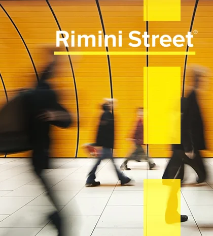
Rimini Street is a leading independent provider of premium enterprise support services. They recently undertook a brand refresh, with the intent to better communicate with the technology-driven industry they serve, and a way to utilize the 'street' in their name.
A complete style guide overhaul was needed. The logo was updated, a new 'street' graphic integration was introduced, a new catalogue of photography was brought in, and new icons and motion graphics were developed to give a unified and strong presence to the brand. Everything from print, digital, video, and physical branding now has a modern, sleek, and clearly identifiable Rimini Street look.
Art Direction | Design | Illustration | Motion Graphics | Web Design
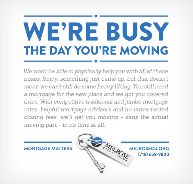
NYC-based Melrose Credit Union has a no-nonsense approach to mortgages. They offer competitive rates, have a no-sell policy, and they do away with many unnecessary fees. The "Mortgage Matters" campaign combines direct, truthful, and playful language with boldly displayed headlines, creating a recognizably fun identity that speaks directly to the fast-paced NYC market.
Art Direction | Design
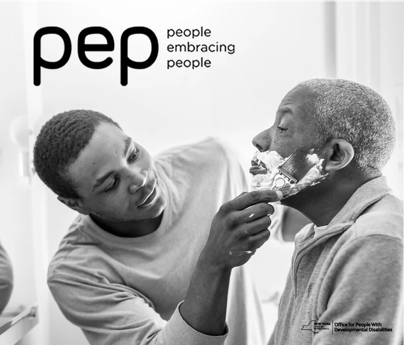
PEP is a New York State initiative whose objective is to place individuals with developmental disabilities into people's homes to be cared for and supported. The launch of the initiative was carried out with a two-part campaign that ran on TV, radio, and OOH print all around New York City, and also included a pop-up shop for potential caregivers to visit and ask questions.
Stunning black and white photography (taken of actual caregivers and individuals with developmental disabilities) forms the foundation of the campaign's look, with very little color or other graphical elements to distract from the emotional impact.
Art Direction | Retouching | Web Design | Motion Graphics
After introducing the "Generating Impact" campaign, Genpact needed an overhaul of graphic elements that were interesting, colorful, and useful across many different mediums. The solution was to create a catalogue of branded graphics based on the industries and solutions Genpact works with.
Over 25 graphics were made and applied in all types of spaces; from backgrounds of digital banners — to focal points of print ads — to the giant art installations we placed throughout their office building.
Art Direction | Design | Illustration | Web Design
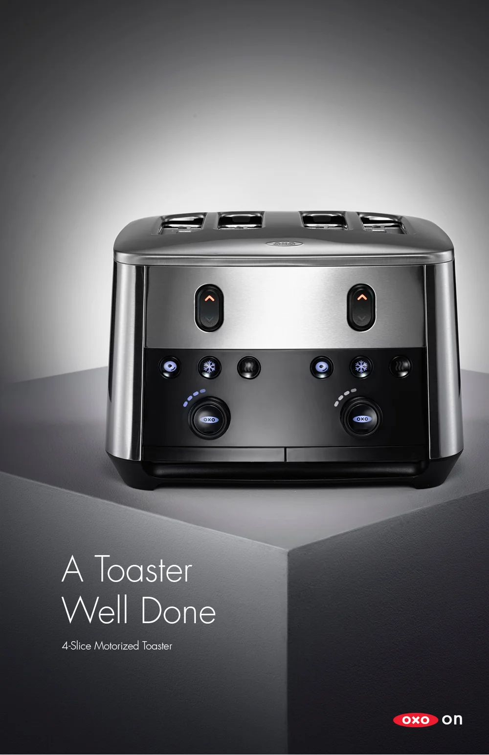
While most people probably have an OXO product in their kitchen, they may not be aware of the brand. The "Love, OXO" campaign allowed OXO to showcase its everyday items in love letters to consumers. These letters were built as rich animated banner ads, over 20 in total in multiple sizes.
Design | Concepting | Banner Development
Cirrus knows that college graduates love their alma mater, and that those with a home gym might want to use the same equipment the athletes at their school use. They teamed up with the NCAA and several home fitness equipment manufacturers to bring that idea to life.
To make the products look like they came from the same place the schools source, they needed a unique approach to product design and packaging. The solution was to create something that had that "straight from the warehouse" look, while also incorporating sports imagery and school colors. A stripped-down template-based foundation made it easy for brands to pop in their logo and colors, and the grittiness of the packaging appealed to those die-hard fitness freaks.
Art Direction | Product Design | Packaging